00
Design System
One system. Every Signal page.
Use these existing styles, color tokens, images, and components before creating anything new. The examples below are live and editable.
01
Typography
80 · Bricolage Grotesque · 600 · Responsive
Social content built to stop the scroll.
56 · Bricolage Grotesque · 600 · Responsive
A clear direction for your content.
48 · Bricolage Grotesque · 600 · Responsive
The work behind the numbers.
32 · Bricolage Grotesque · 600 · Responsive
Ideas built to travel.
20 · Bricolage Grotesque · 600 · Responsive
Better briefs, better content
18 · Bricolage Grotesque · 500 · Responsive
Use for body copy, descriptions, and supporting content.
Pixel 64 · Geist Pixel · 400 · Responsive
90+ PROJECTS
Pixel 18 · Geist Pixel · 400
SECTION LABEL
Pixel 14 · Geist Pixel · 400
METADATA · 2026
02
Colours
BG
#F9F8F6
Black
#243024
Primary
#FF6417
Secondary 1
#FF8F57
Secondary 2
#FFAA80
Secondary 3
#FFC3A6
Secondary 4
#FFE4D6
Surface
#EBE8E4
Border
#E3DFDD
Grey Text
#697069
Grey Text 2
#B7BDB7
Dark Green
#244224
White
#FFFFFF
03
Imagery
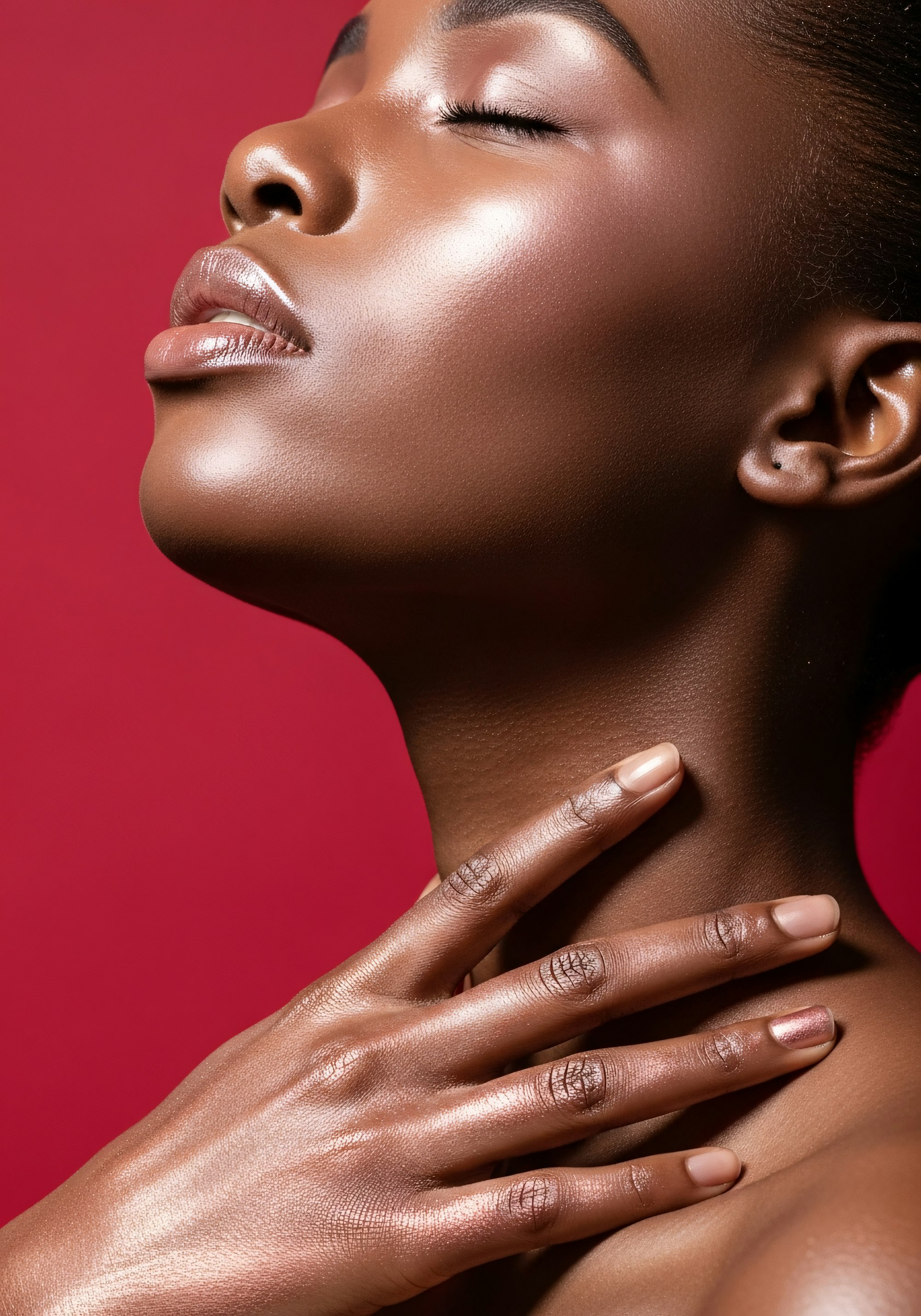
Use bold, editorial imagery with clear subjects, confident crops, and enough visual space for the surrounding layout to breathe.




04
Components
A curated reference of the native components used most often across the Signal template. Edit the source component when a change should apply everywhere.
Strategy
Who We Are

Maya
DTC Founder
“Signal Studio translated our product into creator videos that looked organic, not over-produced. The first batch gave us ad tests and organic posts in one sprint.”


Signal Logo
" height="8px" id="g192rF_I4" width="8px"/><path d="M 0 2 C 0 0.895 0.895 0 2 0 C 3.222 0 4.778 0 6 0 C 7.105 0 8 0.895 8 2 C 8 3.222 8 4.778 8 6 C 8 7.104 7.104 8 6 8 C 4.778 8 3.222 8 2 8 C 0.895 8 0 7.105 0 6 C 0 4.778 0 3.222 0 2 Z" fill="rgb(255, 195, 166)" height="8px" id="Tuo5LiNGK" transform="translate(8 0)" width="8px"/><path d="M 0 2 C 0 0.895 0.895 0 2 0 C 3.222 0 4.778 0 6 0 C 7.105 0 8 0.895 8 2 C 8 3.222 8 4.778 8 6 C 8 7.104 7.104 8 6 8 C 4.778 8 3.222 8 2 8 C 0.895 8 0 7.105 0 6 C 0 4.778 0 3.222 0 2 Z" fill="rgb(255, 170, 128)" height="8px" id="Z3Iq_lJDp" transform="translate(0 8)" width="8px"/><path d="M 0 2 C 0 0.895 0.895 0 2 0 C 3.222 0 4.778 0 6 0 C 7.105 0 8 0.895 8 2 C 8 3.222 8 4.778 8 6 C 8 7.104 7.104 8 6 8 C 4.778 8 3.222 8 2 8 C 0.895 8 0 7.105 0 6 C 0 4.778 0 3.222 0 2 Z" fill="rgb(255, 100, 23)" height="8px" id="LfH0nE0ss" transform="translate(8 8)" width="8px"/></svg>)
Signal Icons
Arrow Right
Pause
Close Icon
Plus
TikTok
Minus
Menu
Sparkle
Globe
Play
Pin
Phone
Eye
Shared Header
Edit the shared header and footer in the Template layout. This is an editable reference copy.
Shared Footer
Edit the shared header and footer in the Template layout. This is an editable reference copy.
Rolling Text / Text Follow Path
Carousel
05
Usage notes
Heading Rows
Pair the Eyebrow Headline with the 56 style. Keep the eyebrow column near 30% on desktop, then stack it above the heading on phone.
Cards
Reuse the existing card components and their demonstrated radius, rim, shadow, and tilt treatments instead of rebuilding them from scratch.
Page Reveal
Turn the 👀 Page Reveal animation off while editing. Turn it back on before previewing the final experience.
Responsive
Check Desktop, Tablet, and Phone. Preserve each component’s existing responsive variant whenever one is available.